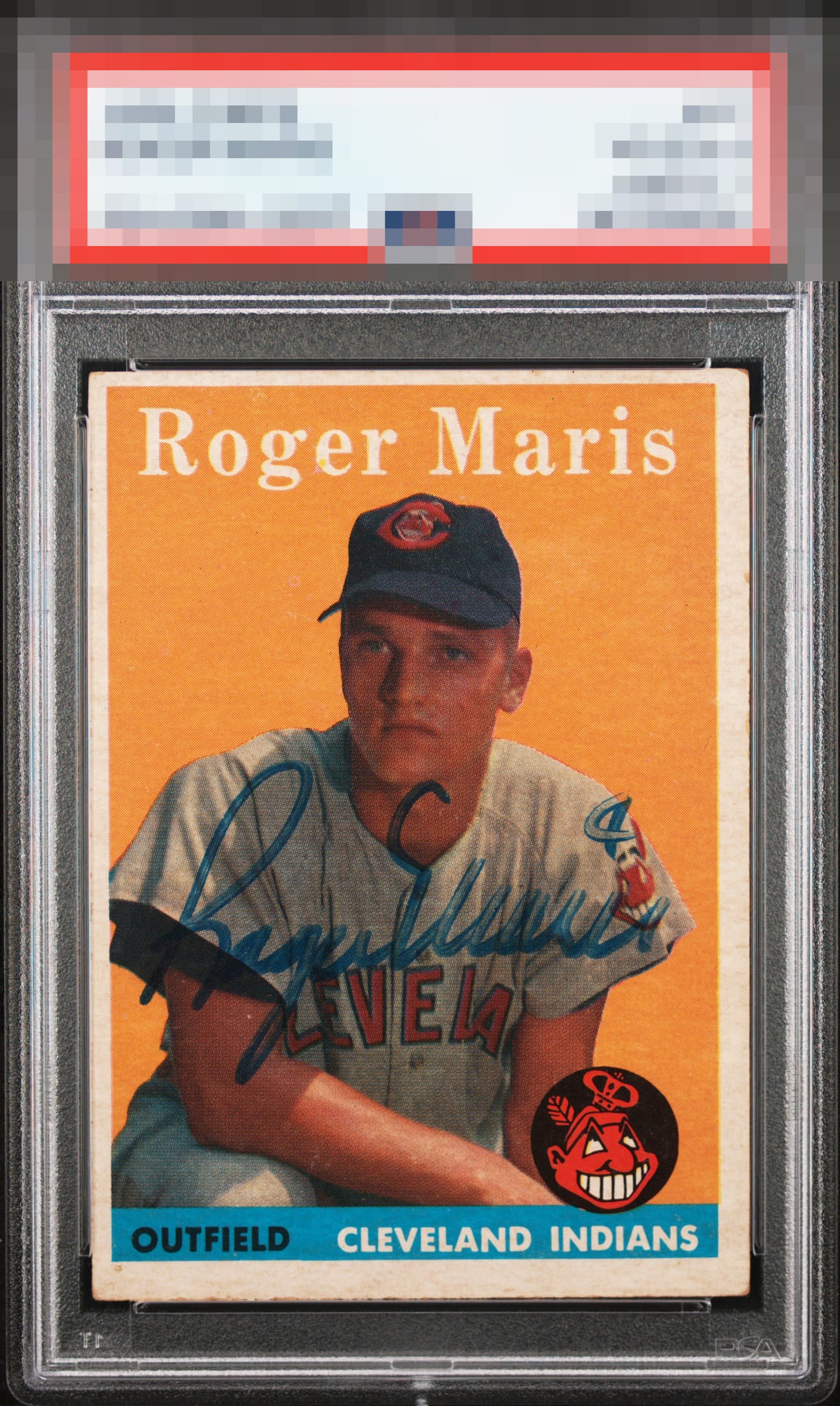
1958 Topps Roger Maris #47
1 / 2
💬
Reviews & Discussions
9 total reviews
Give me bolder ink or better centering and this is in the rarefied A's zone.


Nice color and I like the placing of the signature. Centering being off brings down the eye appeal.

Nice looking card with a nice clean autograph that is well placed. The borders are nice and bright but centering holds it back

Love the focus. Centering and the fading in the last name hurt the eye appeal a bit.

9 reviews

0 reviews
EyeQ+
--
Global Population
3
POPULATION ACROSS ALL GRADES AND GRADING COMPANIES
Global Eye Rank
—
No Eye Q+ score
Population in Grade
1
POPULATION IN THIS GRADE ACROSS ALL GRADING COMPANIES
Eye Rank in Grade
—
No Eye Q+ score
EYEQ+ TROPHY CASE

GLOBAL

IN-GRADE
Trophies appear here when earned.
📊
Rating Distribution
9 total reviews
G
0%
A+
0%
A
0%
A-
0%
B+
3 ratings
33%
3
B
3 ratings
33%
3
B-
2 ratings
22%
2
C+
1 rating
11%
1
C
0%
C-
0%
D+
0%
D
0%
D-
0%
F
0%
Card itself is very strong for signed vintage. Couple dings for the centering and auto which could be a lot more vivid