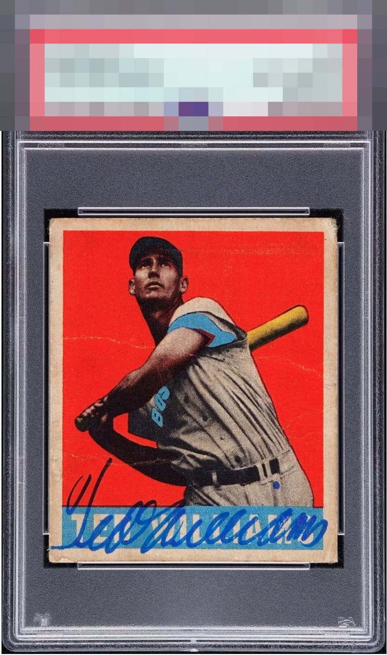
1948 Leaf Ted Williams #76
Reviews & Discussions
10 total reviews

Really love this card. Have to think Ted purposely tried to keep the signature out of the way of the image itself. I barely see the creases and hardly ding the score for it at all. The red is so deep, and the centering is arguably immaculate.
This was a fascinating one to review. It's interesting to see how a card surprises us or what it makes us think and notice about our interaction with it. At first glance, the centering, registration, and bold color drew me in. I then thought, "There's no way I will dig this, though, because of auto placement." The crease, that took me a moment to see and then was easily dismissed by my eye. At a casual, normal, viewing distance, that crease is nothing to me. So it came back around to the placement. And as I spent more time looking at it, and even glancing back now, much to my surprise it has grown on me. I do see it, and don't see the name typed behind it. I would snap this up and love to see it in my collection. Signed vintage is fun to review because seeing beauty in these is really so subjective; it's great to see our unique views on these special pieces.

Great centering and coloring. but the massive creases across the front hurt the eye appeal. Additionally, I have a hard time digesting the auto with its placement over the name.


Underrated due to location of the auto. Coloring is fantastic! Vibrant! Strong centering, love this card
card is a beauty the autograph is in the worst place possible making it look like scribble on the card. Centering is nice borders are discolored
EyeQ+
EYEQ+ TROPHY CASE


Rating Distribution
10 total reviews
this is god mode