1933 Goudey Babe Ruth #149

Reviews & Discussions
6 total reviews
Highly, highly satisfying to the eye. Somehow, the color and image here just hold your attention and you don't really say to yourself, "These corners are worn, and the centering is off." And I say that as a centering guy. Proof that eye appeal really is not math or science. This is going to be a pound for pount beast when its EyeQ+ score unlocks.

Bold colors and strong clarity. Major corner wear and off centering holds this down a bit, but still comes across as a card that should be graded much higher than a 1.


Beautiful card, if it was left to right centered I would give it a higher score but incredible for the grade.
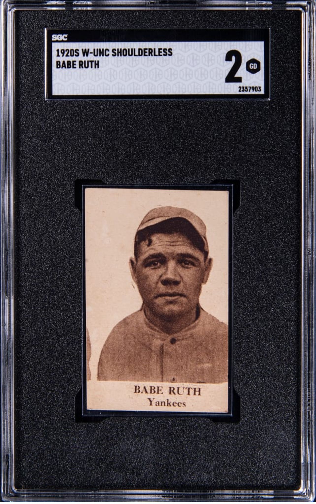
ALL I see the the red and the image. Both of them just POP out and really catch my eye. The off centering and the discoloration bothers me as I am a BORDERS guy. But that Image over rides the rest

EyeQ+
EYEQ+ TROPHY CASE


Rating Distribution
6 total reviews
A great looking “1” with eye appeal that far surpasses the technical grade. The color pops and the centering is actually pretty nice for a red Ruth.