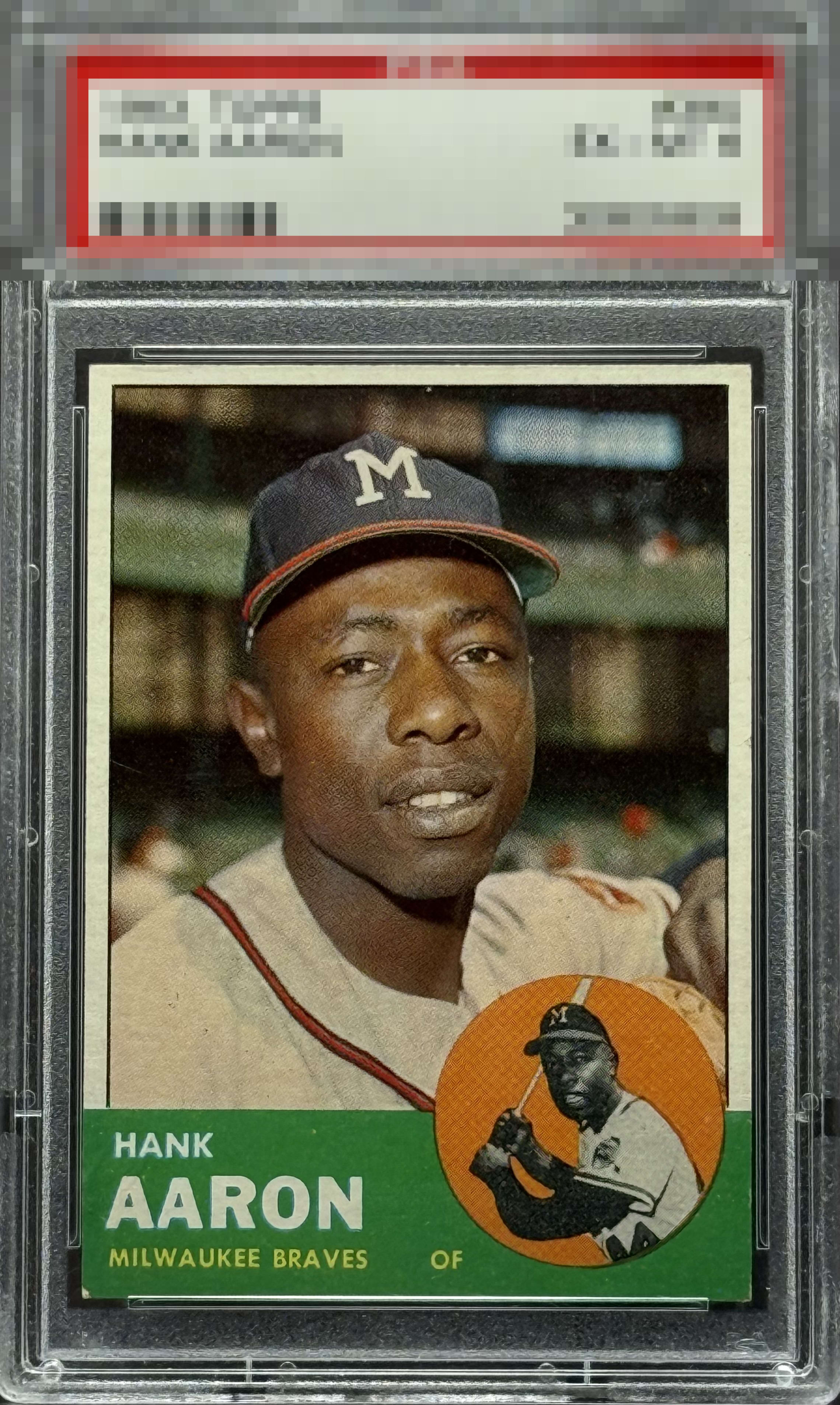
1963 Topps Hank Aaron #390
1 / 2

💬
Reviews & Discussions
4 total reviews

Nice colors, image and centering. Overall very clean and nice eye appeal

Strong. Like the clean green bottom and the clean batting Hank. Lots of PD usually in those areas. Centering great. Lower left does grab my eye.
4 reviews

0 reviews
EyeQ+
--
Global Population
1
POPULATION ACROSS ALL GRADES AND GRADING COMPANIES
Global Eye Rank
—
No Eye Q+ score
Population in Grade
1
POPULATION IN THIS GRADE ACROSS ALL GRADING COMPANIES
Eye Rank in Grade
—
No Eye Q+ score
EYEQ+ TROPHY CASE

GLOBAL

IN-GRADE
Trophies appear here when earned.
📊
Rating Distribution
4 total reviews
G
0%
A+
1 rating
25%
1
A
0%
A-
3 ratings
75%
3
B+
0%
B
0%
B-
0%
C+
0%
C
0%
C-
0%
D+
0%
D
0%
D-
0%
F
0%
Clean colored backgrounds on this one. Only thing that grabs my eye is lower left; not a corner guy here but on this card it is noticeable. Still, gets an overall high eye appeal grade.