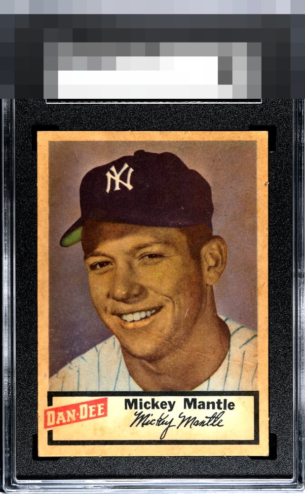
1954 Dan Dee Mickey Mantle
Reviews & Discussions
5 total reviews

The centering is stellar. The corners also please my eye. I rather like the potato chip grease toning here, it is similar to caramel stains on a Cracker Jack-- proof the card was distributed as intended. They add eye appeal to me and character. The wrinkle is a textbook "eye appeal" wrinkle; there, so it should be part of the third party grading company criteria, yet not there in the sense that the human eye--at least mine--barely notices it. The back of a card matters nothing to me.

Beautifully centered, has that grease potato chip stain like it should! Small crease and significant stain bring the score a little lower but a great card.

Great centering and the eye appeal is overall rather strong, especially for the grade. The staining doesn't bother me and feels age appropriate. The creasing is well hidden. If it stopped short of his chin this would rank even higher. Perfect example of flaws that somehow kill numerical grade but still allow for solid eye appeal.
love this card and the ad back. But this is one of the more discolored I have ever seen. Actually it is so consistent thru out from afar it looks almost normal

EyeQ+
EYEQ+ TROPHY CASE


Rating Distribution
5 total reviews
Calm down TPG on Grade 1. This is a windmill slam dunk on centering and corners. While white borders would make this specimen "pop" in your face, I can see past the discoloration. The crease from chin to shoulder keep it from GT status for me. Would be more than pleased to have it in my collection.