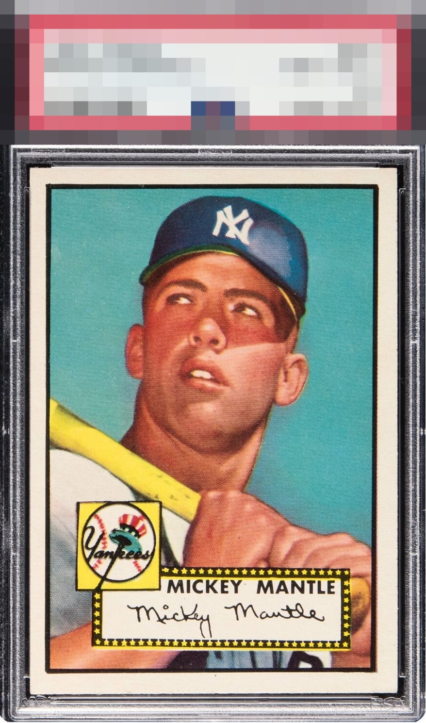
1952 Topps Mickey Mantle #311
1 / 2
💬
Reviews & Discussions
4 total reviews

great looking card and sharp colors. Corners and borders are strong. Slight off center but a Wow card
Sharp card yet the tilt and centering drag it down for my eye. That left border at the bottom is too thin compared to the right border. Plus it is centered a click high, as well.
4 reviews

0 reviews
EyeQ+
--
Global Population
95
POPULATION ACROSS ALL GRADES AND GRADING COMPANIES
Global Eye Rank
—
No Eye Q+ score
Population in Grade
3
POPULATION IN THIS GRADE ACROSS ALL GRADING COMPANIES
Eye Rank in Grade
—
No Eye Q+ score
EYEQ+ TROPHY CASE

GLOBAL

IN-GRADE
Trophies appear here when earned.
📊
Rating Distribution
4 total reviews
G
0%
A+
0%
A
2 ratings
50%
2
A-
2 ratings
50%
2
B+
0%
B
0%
B-
0%
C+
0%
C
0%
C-
0%
D+
0%
D
0%
D-
0%
F
0%
It's pretty, yet would be prettier to my eye if one corner was more worn and the centering perfect. Sharp corners and white borders with slick edges. Super clean surface. All these features make it pretty yet it is fails to satisfy my eye completely because of the equally obvious off centering. If I am paying over 1 million bucks I need better centering than this.