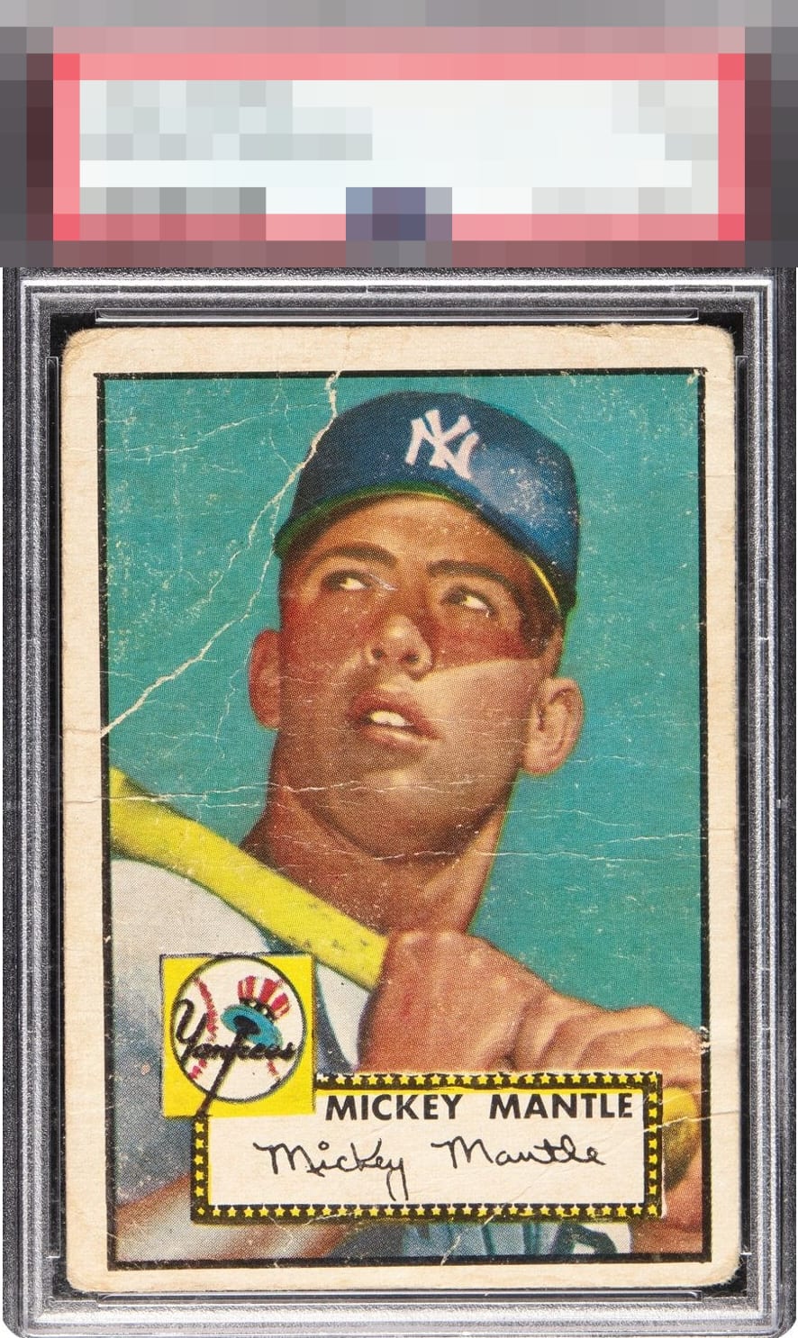
1952 Topps Mickey Mantle #311
1 / 2
💬
Reviews & Discussions
4 total reviews

all those creases and major issues on the corners. The colors are faded
Tilt, poor centering, and severe wrinkles make this an accurately graded 1 that delivers eye appeal commensurate with that grade. This is what a 1 is supposed to look like. Just a worn and loved card that survived time.
4 reviews

0 reviews
EyeQ+
--
Global Population
95
POPULATION ACROSS ALL GRADES AND GRADING COMPANIES
Global Eye Rank
—
No Eye Q+ score
Population in Grade
73
POPULATION IN THIS GRADE ACROSS ALL GRADING COMPANIES
Eye Rank in Grade
—
No Eye Q+ score
EYEQ+ TROPHY CASE

GLOBAL

IN-GRADE
Trophies appear here when earned.
📊
Rating Distribution
4 total reviews
G
0%
A+
0%
A
0%
A-
0%
B+
0%
B
0%
B-
0%
C+
0%
C
0%
C-
1 rating
25%
1
D+
1 rating
25%
1
D
1 rating
25%
1
D-
0%
F
1 rating
25%
1
Basically what a 1 should look like. A tad better because the face is almost unscathed.