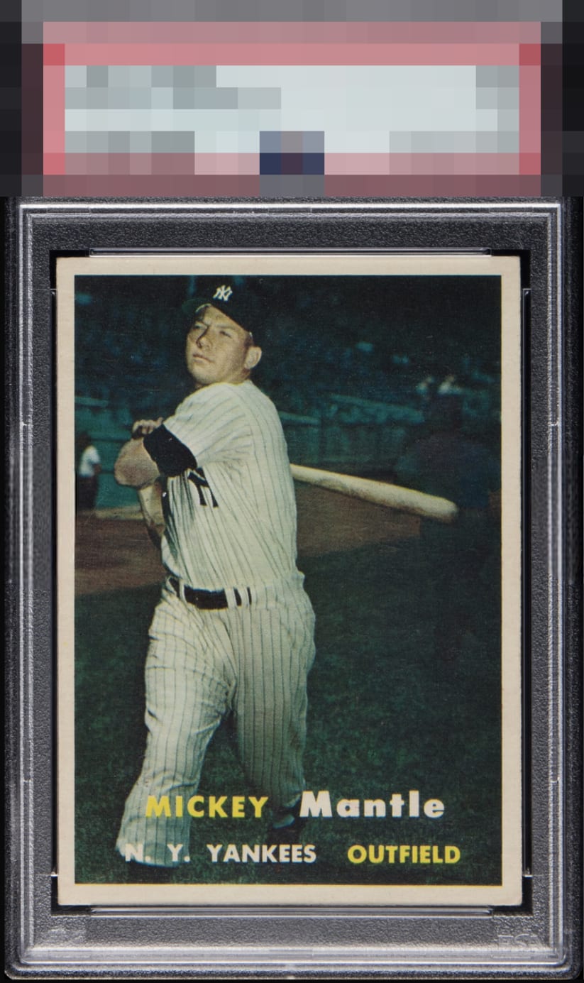
1957 Topps Mickey Mantle #95
1 / 2

💬
Reviews & Discussions
5 total reviews

Mild yet noticeable tilt when looking at the bottom corner/border areas. Superb color and contrast, and overall centering.

Beautiful copy for me, can't see anything wrong with it, nice card.
This is simply a card I would never seek to upgrade, if I owned it. The contrast is fantastic, the image focused, the borders crisp white, and only the faintest degree of tilt visible when comparing the bottom side border width. Love this copy and I know this card's population deeply.
5 reviews

0 reviews
EyeQ+
--
Global Population
13
POPULATION ACROSS ALL GRADES AND GRADING COMPANIES
Global Eye Rank
—
No Eye Q+ score
Population in Grade
1
POPULATION IN THIS GRADE ACROSS ALL GRADING COMPANIES
Eye Rank in Grade
—
No Eye Q+ score
EYEQ+ TROPHY CASE

GLOBAL

IN-GRADE
Trophies appear here when earned.
📊
Rating Distribution
5 total reviews
G
2 ratings
40%
2
A+
1 rating
20%
1
A
1 rating
20%
1
A-
0%
B+
0%
B
1 rating
20%
1
B-
0%
C+
0%
C
0%
C-
0%
D+
0%
D
0%
D-
0%
F
0%
This 57 Topps Mantle presents beautifully in nearly every regard. The colors, centering, and overall print quality make it a standout example. The only distraction is the green-blue tint to the image, which for me takes away a bit from its ideal look. I lean toward the version with the more natural tone. Even so, this copy earns a solid A.