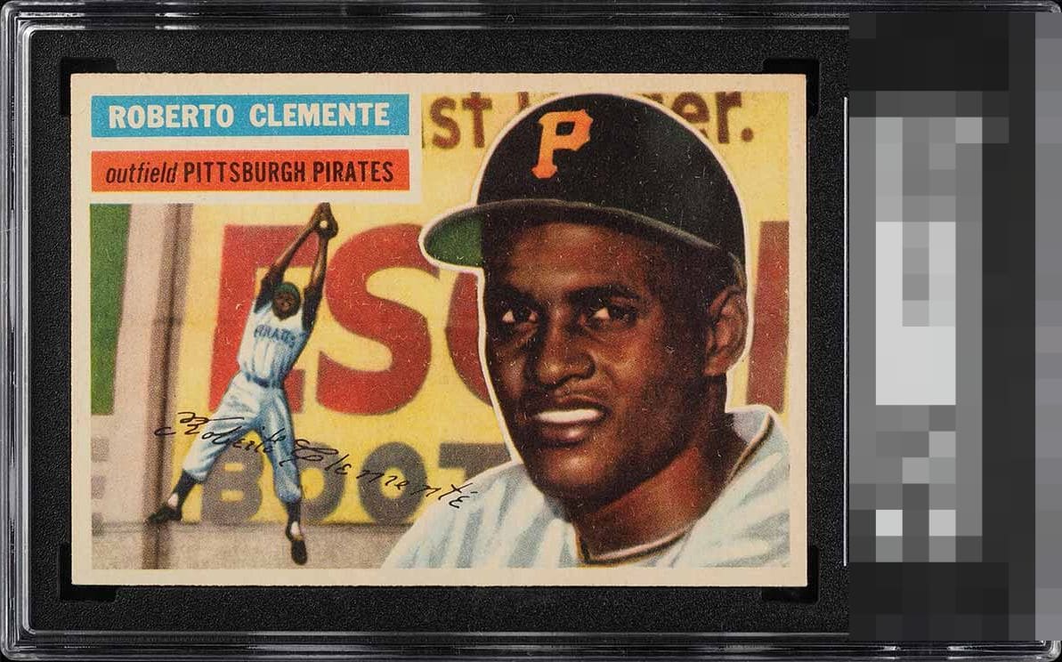
1956 Topps Roberto Clemente #33
1 / 2

💬
Reviews & Discussions
4 total reviews


This card is all that. It has the nice centering and the image is strong and some nice coloring. The card has yellowed a bit with age
4 reviews

0 reviews
EyeQ+
--
Global Population
1
POPULATION ACROSS ALL GRADES AND GRADING COMPANIES
Global Eye Rank
—
No Eye Q+ score
Population in Grade
1
POPULATION IN THIS GRADE ACROSS ALL GRADING COMPANIES
Eye Rank in Grade
—
No Eye Q+ score
EYEQ+ TROPHY CASE

GLOBAL

IN-GRADE
Trophies appear here when earned.
📊
Rating Distribution
4 total reviews
G
1 rating
25%
1
A+
1 rating
25%
1
A
0%
A-
1 rating
25%
1
B+
1 rating
25%
1
B
0%
B-
0%
C+
0%
C
0%
C-
0%
D+
0%
D
0%
D-
0%
F
0%
15% my a$$. This card hits my eye more like top .001% for its grade. We'll see where it ranks among all 5.5s in all grading companies when all is said and done. For now, while I see the sort of speckling in the image, its generalized across the card and so it is easy for me to ignore. What I cannot ignore is the near dead on centering (mild tilt) and how sharp it looks overall. That word is really key with eye appeal: overall. This card just has 'it' to my eye.