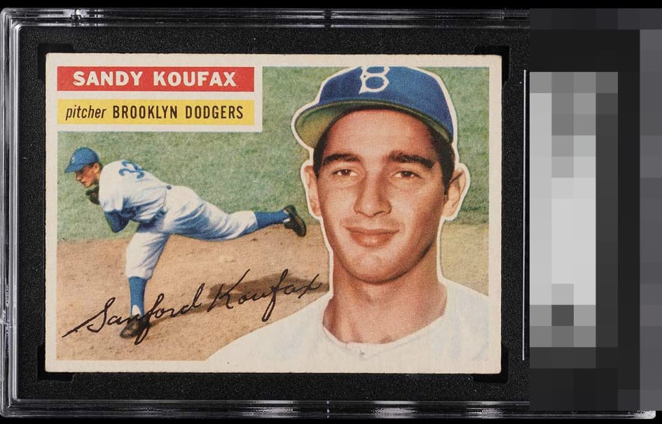
1956 Topps Sandy Koufax #79
1 / 2

💬
Reviews & Discussions
5 total reviews
The ONLY thing I could see improving if this were mine is the side centering and that's by a very thin margin. Bravo. This is the sweet spot of collecting right here. As some have said: put this side by side with a worse centered 7 or 8 and step back a foot, and all is revealed ;)

There is a microscopic chance that, if I owned this, I could find one with all the same features and one MM better side centering. This is exactly what Eye Appeal is about. Delivers huge visual satisfaction without needing to be deemed at the top of the grading company criteria.

good looking card. off center but not dramatically. and the borders have a nice look. The colors and the image are strong with no obvious blemishes
5 reviews

0 reviews
EyeQ+
--
Global Population
2
POPULATION ACROSS ALL GRADES AND GRADING COMPANIES
Global Eye Rank
—
No Eye Q+ score
Population in Grade
1
POPULATION IN THIS GRADE ACROSS ALL GRADING COMPANIES
Eye Rank in Grade
—
No Eye Q+ score
EYEQ+ TROPHY CASE

GLOBAL

IN-GRADE
Trophies appear here when earned.
📊
Rating Distribution
5 total reviews
G
0%
A+
2 ratings
40%
2
A
0%
A-
2 ratings
40%
2
B+
1 rating
20%
1
B
0%
B-
0%
C+
0%
C
0%
C-
0%
D+
0%
D
0%
D-
0%
F
0%
White back 56s always have this more pale and washed out looking print, that's how they are supposed to look, so I don't dock it for that. But the card has some tilt to it or is slightly diamond cut, which hurts it for me. But it's otherwise flawless.